Enterprise SaaS / FinOps
Service Adviser Tasking
Users could see cloud savings opportunities. They couldn't act on them. This project redesigned the Service Adviser from a passive reporting tool into an actionable tasking system — with structured workflows, org-level visibility, and a live status layer that closed the loop between insight and outcome.

Results
"I'm not able to figure out how to take action on a savings recommendation."
Direct user feedback — the sentence that defined the project brief
Research
Two inputs shaped the problem definition: direct user feedback named the failure modes, and Heap analytics proved they were widespread. Neither alone would have been enough — the quotes told us what was broken, the data told us how many people were hitting it.
User Feedback
- "I need to be able to track actions on savings — right now there's no way to know what's been done"
- "We need to report on savings: what was implemented, what's still open, what was ignored and why"
- "The settings for a savings recommendation are hidden — I can never find where to actually do something"
- "I'm not able to figure out how to take action on a savings recommendation"
- "I need to be able to see savings at a business organization level, not just individual services"
Behavioral Data
The Heap funnel told a sharp story. Of users who reached the Service Adviser Overview, 56.8% continued to an individual service — but only 13.6% of those went on to take any action. The total funnel completion rate was 4.18%.
- —Highest drop-off happened after the AWS Service Adviser step
- —Users spent time in the tool but left without acting
- —Almost no users reached the automation feature
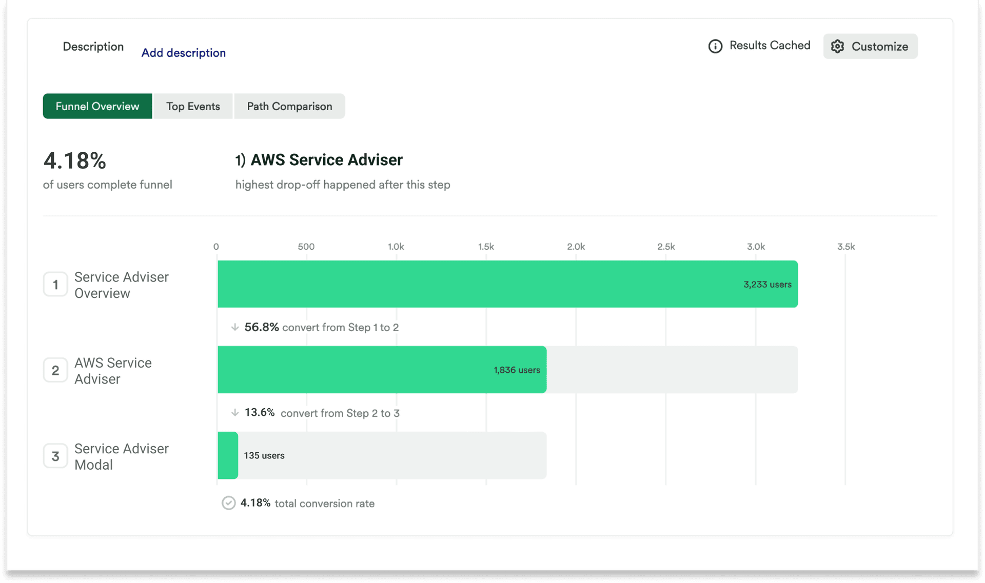
Funnel analysis showing only 4.18% of users completing the path from Service Adviser Overview to taking an action. The sharpest drop-off was between viewing a service and engaging with any action control.
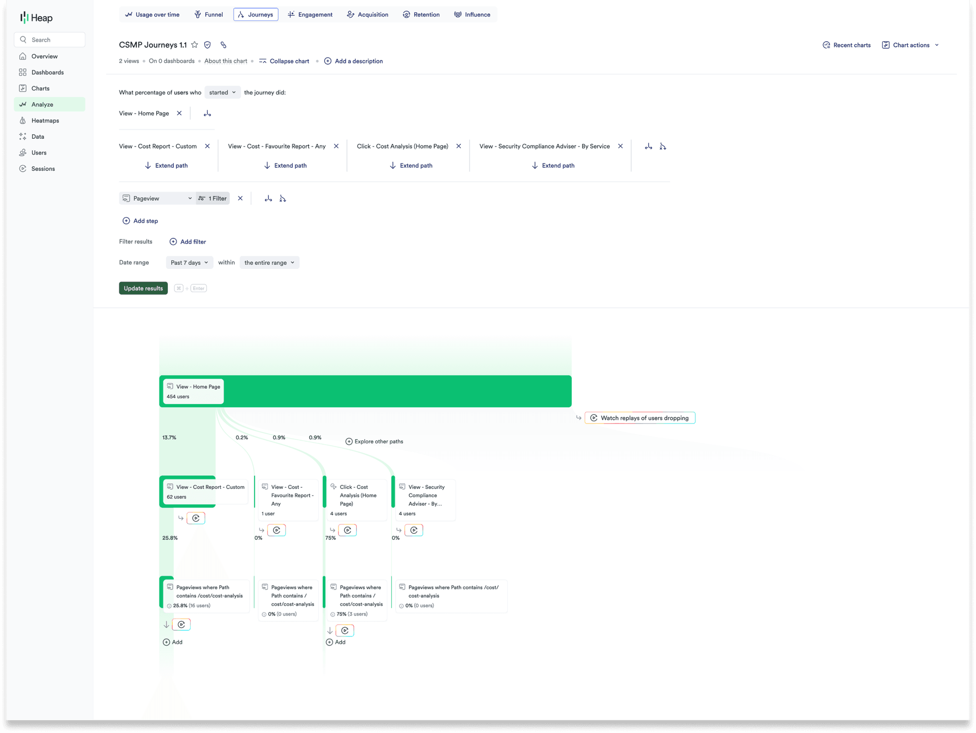
Journey mapping revealed users were leaving Service Adviser for unrelated parts of the product — a sign they weren't finding what they needed, not that they'd finished their task.
Users
Three distinct roles interact with Service Adviser — each with different responsibilities, different authority levels, and different definitions of "done." Designing for one without the others would have replicated the same problem the original product had.
Building & Viewing Reports
FinOps Analyst
Tracks savings opportunities across the organization and reports to leadership on cloud cost performance. Doesn't implement changes directly — needs visibility into what's been assigned, automated, and completed across the team.
Design Payoff
Org-level reporting · Savings history · Automation report
Implementing and Delegating
FinOps Engineer
Owns implementation — evaluates recommendations, decides what to act on, delegates to Application Owners, and sets up automations. The primary decision-maker in the action workflow. Needs bulk actions, assignment tools, and a clear view of in-progress work.
Design Payoff
Assign · Bulk actions · Setup Automation
Implementing
Application Owner
Takes action on recommendations affecting their services — often the final step in the delegation chain. Not a FinOps specialist. Needs the interface to make action obvious and safe without requiring deep platform knowledge.
Design Payoff
Potential Savings view · Ignore · Delete All
Challenges
The hardest design problem wasn't creating new capabilities — it was making existing ones findable. The product already had automation, assignment, and reporting in some form. The challenge was that none of them felt like part of the same product, and none of them closed the loop users were looking for.
Product
- —Action capabilities existed but were invisible — buried in settings users couldn't find
- —No assignment mechanism — there was no way to delegate work to a team member
- —No status layer — once an action was triggered, there was no feedback on what was happening
- —Multi-cloud operations added complexity — AWS, Azure, GCP, and VMware all required different handling
Design
- ↗This was an addition to an existing product — every decision had to integrate without disrupting what already worked
- ↗Three user types with different authority levels required the same interface to serve fundamentally different workflows
- ↗The feature had to feel like action software (task managers, PM tools) inside a reporting tool — a significant mental model shift
- ↗The solution needed to work across savings types — unassigned IPs, idle instances, oversized volumes — without custom UI per category
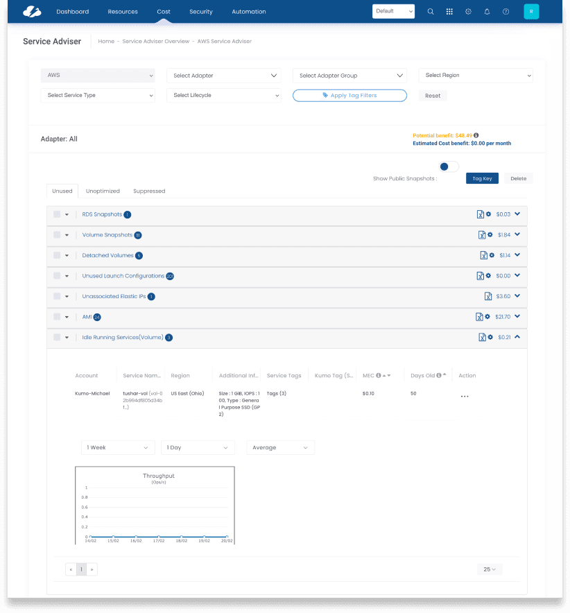
Current State
The product wasn't starting from zero — which made the problem harder to articulate. The skeleton of action capabilities existed, but each gap made the feature feel unreliable rather than empowering. Users could see the surface but couldn't get any traction beneath it.
- —Able to setup automation for actions
- —Able to see savings
- —Detailed savings report
- —Add or Ignore an individual service
- —Limited filtering
Objectives
- ↗Make action-taking the primary experience, not an afterthought
- ↗Introduce org-level savings visibility for FinOps reporting
- ↗Add a status layer so users know what is in progress and what is done
- ↗Surface action settings prominently — not buried in secondary menus
- ↗Support bulk actions across services, not just individual items
- ↗Build a notification pathway for assigning work to team members
Design Process
The feature needed to feel like a task management tool, not a settings panel. The inspiration phase looked at how productivity and project management apps handle assignment, delegation, and progress tracking — then translated those patterns into the FinOps context.
01 — Inspiration
Reporting is typically the top priority for cost management tools, but this section of the app needed to encourage business units, individuals, and others to delete or modify cloud resources for cost savings. Input from productivity applications, project management, and team tasking tools informed the approach.
02 — Sketching Actions
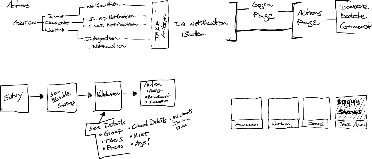
Early sketches mapped the action taxonomy — Assign, Broadcast, Ignore — and explored how notifications, in-app buttons, and integrations (Teams, CloudBolt, webhooks) would connect. The "Take Action" moment was treated as a distinct interaction state, not a menu item.
03 — Sketching Layouts
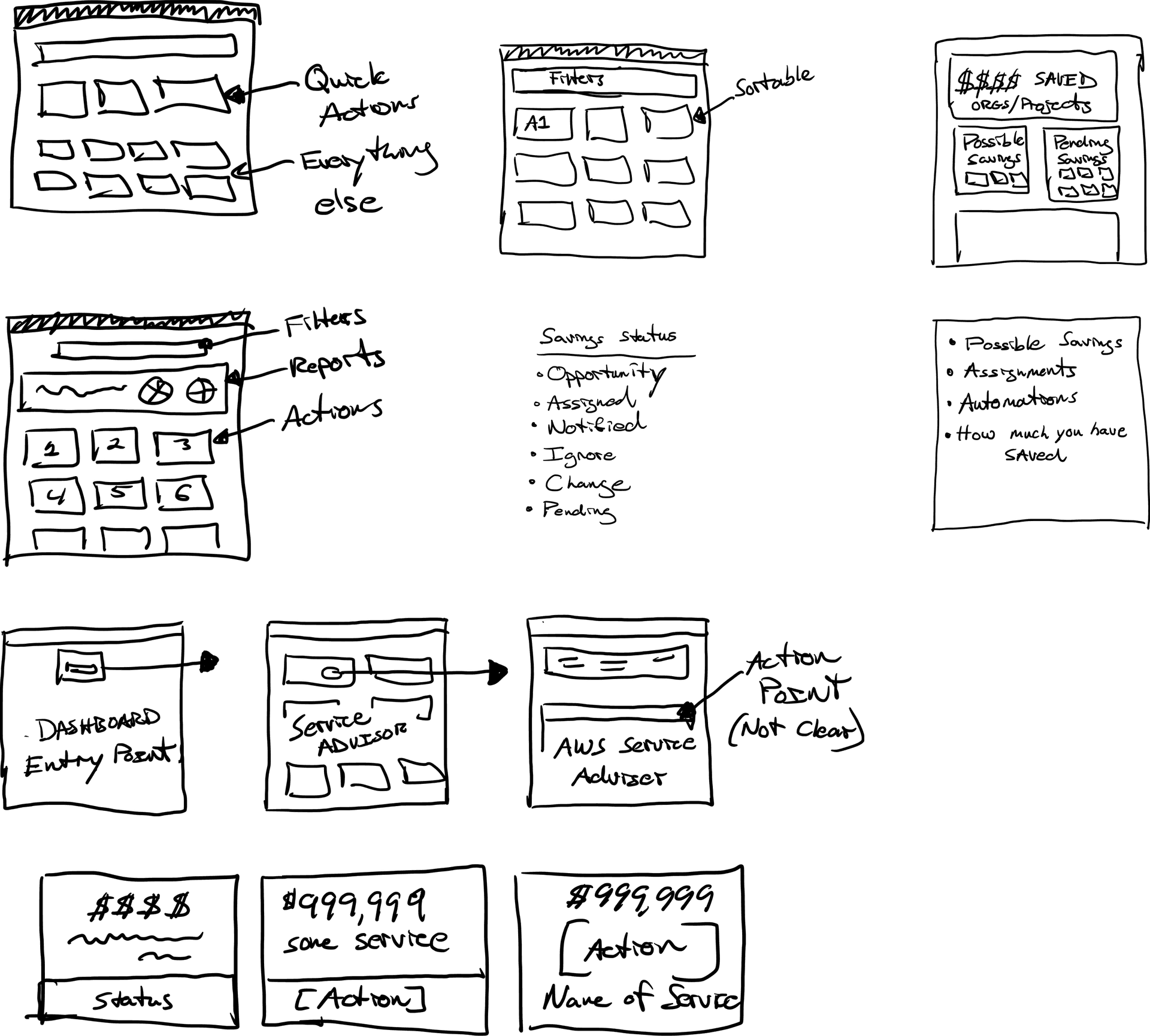
The overview page needed to surface "quick actions" at the top while keeping everything else visible. Savings statuses — Opportunity, Assigned, Notified, Ignore, Change, Pending — drove the layout into distinct sections rather than a flat list.
04 — User Flow
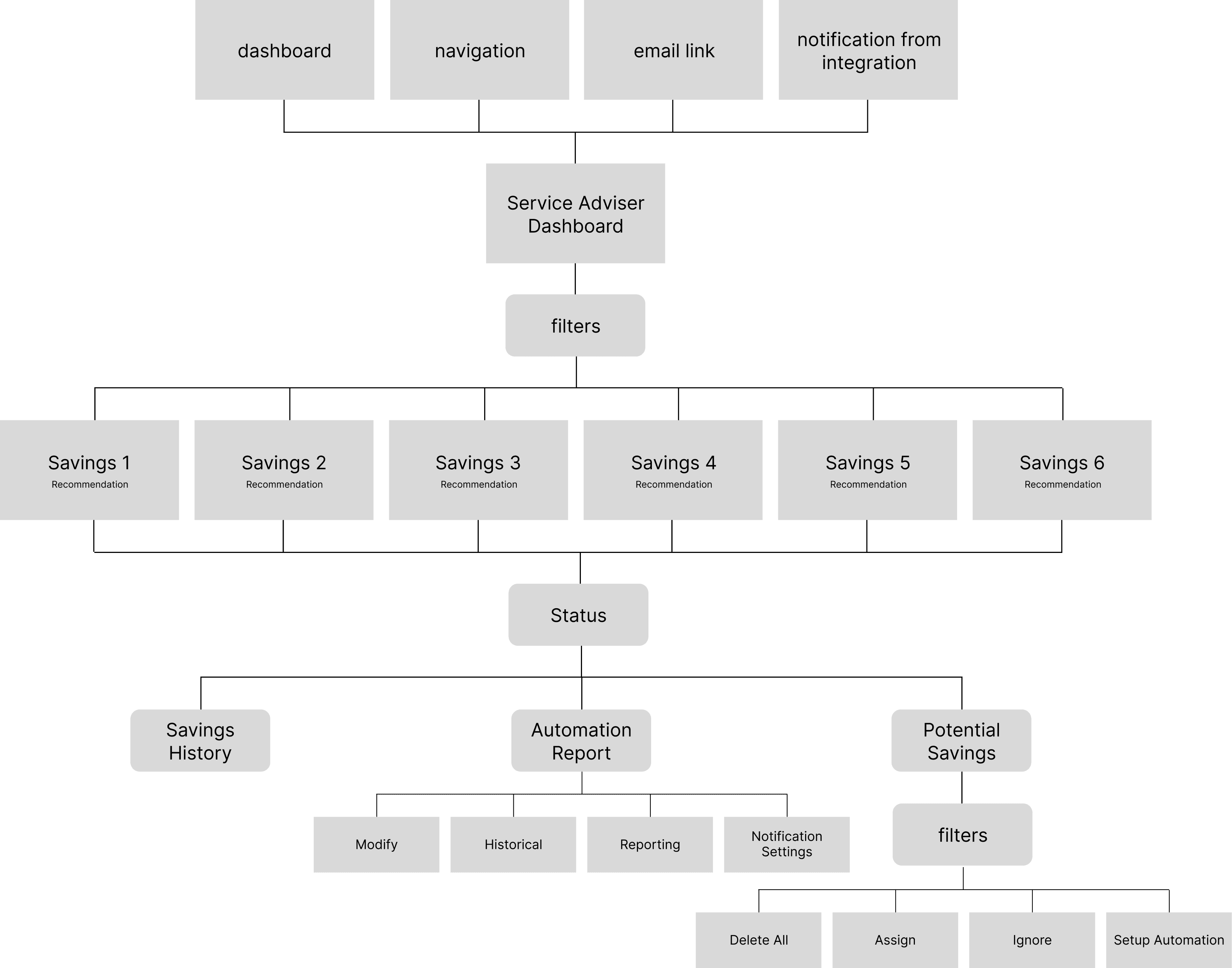
The flow mapped four entry points (dashboard, navigation, email link, integration notification) converging on the Service Adviser Dashboard, then branching into three distinct exit states: Savings History, Automation Report, and Potential Savings — each with its own action surface.
Final Designs
Three core surfaces were redesigned. Each addressed a specific failure mode from the research: the inability to act, the lack of org-level visibility, and the absence of any status layer.
Before
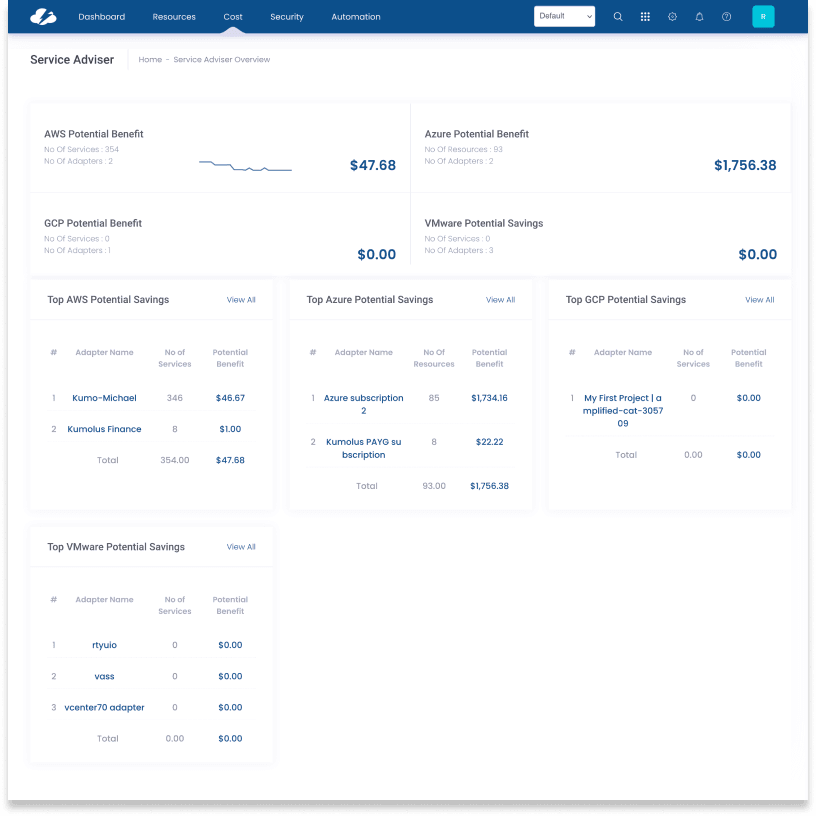
After
Before
After

03
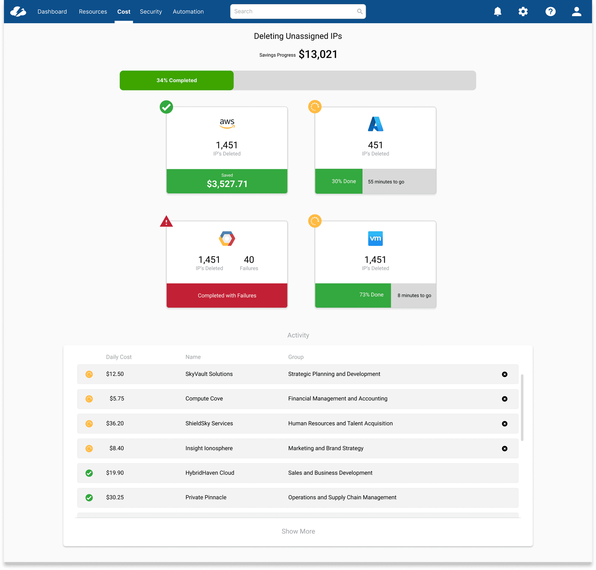
Status Page
This page didn't exist before the redesign. It couldn't — there was nothing to track. Once actions could be triggered at scale across multiple cloud providers, users needed to know what was happening after they clicked. The Status page shows a live progress bar, a per-provider breakdown with completion percentage and estimated time remaining, and a running activity log. It closed the loop that the original product had never opened.
"For the first time I can show my director what we've actually done with the savings recommendations — not just what we identified."
FinOps Engineer, enterprise customer — post-launch
Reflection
What I Learned
The most clarifying moment on this project was recognizing that the problem wasn't missing features — it was a missing mental model. The existing product was built around savings visibility. What users needed was savings accountability. That shift — from a reporting tool to a tasking tool — changed every subsequent design decision.
The 4.18% funnel completion rate was a powerful anchor. It made the problem concrete and quantifiable in a way that user feedback alone couldn't. Pairing behavioral data with direct quotes gave stakeholders two ways to understand the same failure — and made the case for investment before a single new design was shown.
The status page was the most valuable addition we hadn't planned for at the start. Once actions could be triggered at scale across multiple cloud providers, users needed to know what was happening — and the original product had no answer for that. The lesson: when you expand what a product can do, you have to expand what it can tell you about what it's doing.
Next Project
01CMP Platform Redesign
User Research & Strategy