New Category View
Project Achievements
60% Adoption Rate in the first 4 months
Reduce ordering time by 40%
Customers expanded use of cloud services and cloud providers
Implemented a modern front-end framework
20% of orders using new reorders feature
My Role
Design Lead
Product Manager
Engineering Manager
User Researcher
Original Request
The company requested that I update the application's user interface to modernize its appearance, following customer complaints that the design felt outdated.
What is CMP?
CMP is a single pane of glass application that empowers development teams to efficiently manage cloud development services, enabling them to swiftly order, modify, and delete these services.
Current UI
Research
Prior to initiating a visual upgrade of the site, I seized the chance to engage directly with clients to understand their application usage and needs. This approach allowed me to uncover ways to address their problems, rather than solely concentrating on the visual aspects.
Internal Data
Customers only used 1/3 of the clouds available
VM’s still the majority of the orders
Not a lot of clients upgrade to the latest software
Customers are using private and public data centers
Heuristic Evaluation
Not focused on outcomes
Older UI components
Confusing lexicon
Very limited reporting
No real user flows
Internal Feedback
Improve the colors
Improve reporting
More icons
Side navigation
Customer Interviews
I strive to deliver an exceptional experience for my users
I can’t show my boss the value of the tool
I don’t know what my users are doing in the platform
I need developers to be able to order cloud services not just VM’s
Project Outline
Challenges
Admin focuses app
No front-end framework
Limited data
Slow releases
No API’s
No front-end experience
Objectives
Self-Service focused
Front-end framework
Gather metrics
Build Dedicated team
My Role
Design Lead
Product Manager
Engineering Manager
User Researcher
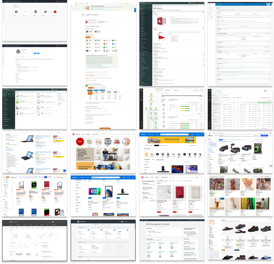
Competitor Analysis
High-Quality Product Images
Utilizing photographs and vibrant colors can make a page more engaging.
Modern Filter Design
Traditional filters on the left can appear cluttered and outdated. Implementing modern filters helps to streamline the space.
Prominent Search Box
The search box is designed to be noticeable and easily accessible.
Category-Based Browsing
Users begin their browsing experience by navigating through clearly defined categories or departments.
Who will be using it?
“I need to quickly order resources for the project I’m working on right now”
Developer Flow
Developer Needs
Order Resources
Edit Resources
Access Resources
Teardown Resources
Design Iterations
The first iteration aimed to identify the quickest enhancements for the catalog view. Although this view was improved, the feedback indicated that it still didn't effectively guide users to what they needed.
I returned to the drawing board to design flush out the category view and determine the placement of other UI elements on the page.
How will the filters and search work?
Aligning with the grid
Final Category View
Old Category View
New Category View
New Category View
Customizable icons to help represent the project or department
Colors can help color coding projects and departments
Simplified view to help focus users on the categories
Final Blueprint View
Old Blueprint View
New Blueprint View
New Blueprint View
Simplified filtering: Combined filter options into one button for a cleaner interface.
Focused features: Removed admin reporting to streamline core functionality.
Default dark mode: Enabled dark mode by default for a modern look similar to other dev tools
Reorder Option
Old Order View
New Order View
Based on feedback from our customers that many of their users frequently reorder the same service configurations, we have added a step to the ordering process that retrieves previously ordered configurations, streamlining and simplifying the ordering experience.
Resource Management
Old Resource Management View
New Resource Management View
Based on feedback from the admin users, I changed the layout from a tab view to a panel dashboard view, enabling users to easily locate all the settings. This new layout provides admins with the flexibility to display the relevant data their users need daily and offers a way to access additional information if required.
Admin Dashboard
Previously, our admin users lacked visibility into the performance of their 'storefront.' We have now equipped them with a dashboard that provides insights into the popularity of their products (services), identifying the best-selling items, the stagnant ones, the error-prone offerings, and tracking customer traffic.
Project Achievements
60% Adoption Rate in the first 4 months
Reduce ordering time by 40%
Customers expanded use of cloud services and cloud providers
Implemented a modern front-end framework
20% of orders using new reorders feature


