AI / Conversational UI
Chat Interface
An internal research project exploring whether a conversational AI interface could lower the barrier for enterprise FinOps users navigating a filter-heavy reporting platform. The work informed a product direction without becoming a shipped feature.
Research
Before exploring where or how to build a chat interface, I looked at what conversational AI was already doing well — and what properties of the pattern would translate to an enterprise FinOps context.
Instant Communication
Answers arrive without a page reload or multi-step filter chain — matching the expectation users bring from modern search. This drove keeping the interface persistent across views rather than a separate page that required navigation.
Convenience
Questions composed without leaving the current context — lower interruption cost than navigating to a dedicated reporting view. Reinforced the bottom bar placement and the decision against a full-screen chat mode.
Query as Signal
Conversational queries generate structured signals about what users are actually trying to understand — a feedback loop that filter-based UIs rarely produce. Shaped how role-specific suggested queries were prioritized by view.
Scalability
A well-designed interface handles a growing query surface without the UI growing with it — no new filters, no new pages. Reinforced the "navigation accelerator" framing: the chat routes into existing product views rather than replicating them.
Brainstorming
The first problem to solve was placement. Where does a chat interface live in a product that has no precedent for one? Getting the location wrong would undermine everything downstream. We landed on the bottom bar — its larger surface area and search-paradigm framing matched how power users already thought about querying data, even if the consumer chatbot position felt more familiar at first glance.
Lower Right — Chatbot
Works for
Familiar placement from consumer products; non-intrusive when collapsed.
Constraint
Limited room in a data-dense enterprise interface. No clear home in the existing app architecture — floats outside the navigation hierarchy.
Bottom Bar — Search Style
Works for
More surface area; closer to how power users think about querying (search paradigm).
Constraint
Covers content when expanded. Still lacks a defined home — it sits outside any existing navigation mental model.
Challenges
- —Enterprise FinOps users are highly skeptical of AI — they need to trust a tool before they change their workflow, and a feature that feels experimental will be ignored
- —A blank input communicates nothing — filter UIs show available dimensions at a glance, giving users a map of what's possible; the chat model has to earn credibility without that scaffolding
- —Detailed investigations require cross-referencing multiple data points simultaneously — chat history scrolls off-screen, which breaks the workflow for the users with the most complex needs
- —FinOps queries are often highly specific — natural language understanding has to be genuinely good, not approximately good; enterprise users will probe its limits immediately
Opportunities
- ↗Display search history — past queries become a record of what the user was investigating
- ↗Build upon previous searches — conversational context lets users refine rather than restart
- ↗Simplified user interface — replaces rows of filter controls with a single input
- ↗Pre-suggested searches — can surface recommended queries based on the current view or user role
Design Decisions
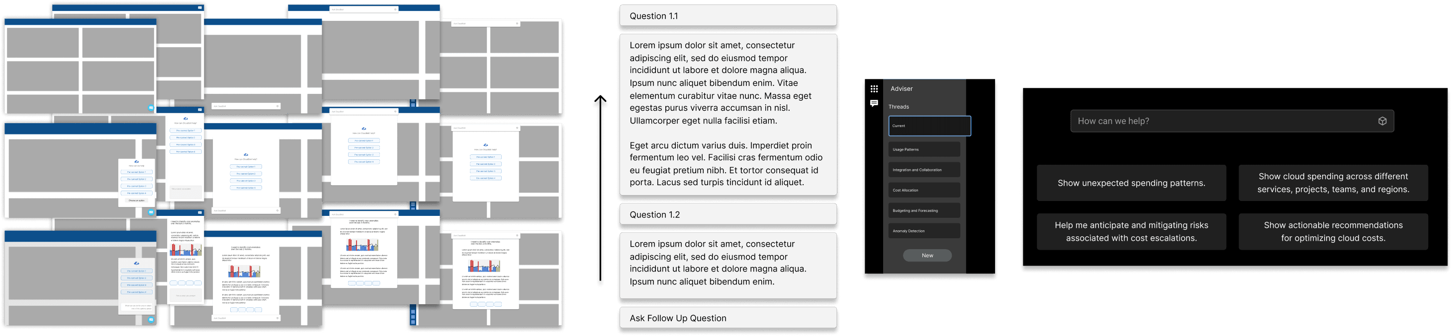
Three early directions were considered and discarded before the final approach was settled.
Discarded
Full chat replacement
Replacing the filter UI entirely with a chat input. Dropped early — enterprise users rely on the visual density of filter controls for complex investigations. A blank input with no affordances felt incomplete and untrustworthy.
Discarded
Inline contextual panel
A side panel that opened alongside the current view. Created too much competition with the existing content — a dense product got denser. Users in testing found it disorienting rather than helpful.
Selected direction
Navigation accelerator
The chat interface routes — it doesn't resolve. Ask a question, surface the right product view, let the existing reporting interface take it from there. This framing made it possible to be genuinely useful without overpromising.
Start with a question input, not a dashboard of options. Declare intent first. Let the system respond.
The design principle that guided every layout decision
Final Design
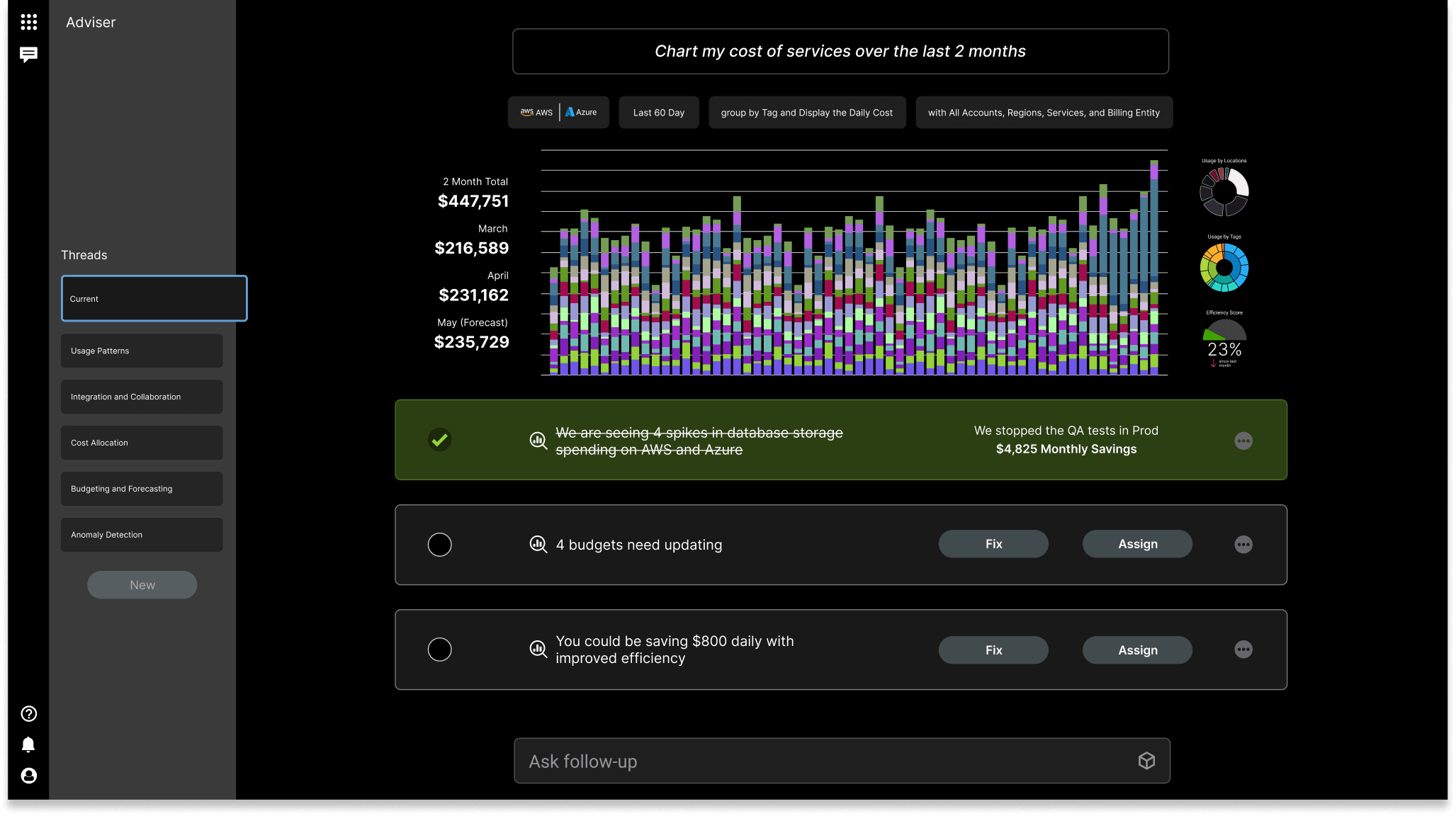
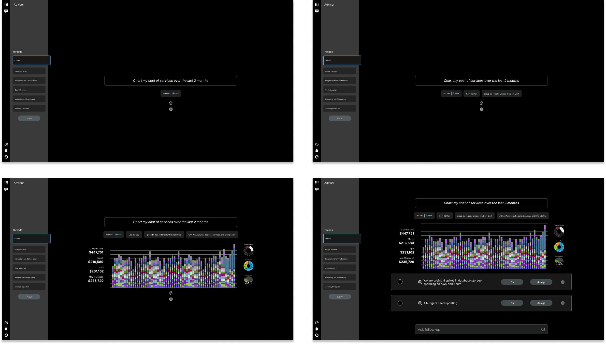
The final design placed the chat interface as a persistent but non-intrusive layer — accessible from any view without replacing the existing navigation model. Three interaction states defined the experience.
01
Input-First Interface
The interface opens to a question input, not a dashboard of options. The user declares intent first and the system responds — cognitive load is front-loaded in the query, not in reading the UI.
02
Contextual Responses
Responses include structured data — tables, summaries, and links back to the relevant product view. The chat doesn't replace the reporting interface, it navigates into it.
03
Suggested Queries
The blank input state surfaces pre-suggested queries by current view and user role. A FinOps analyst on Cost Reports sees different suggestions than a developer on Service Adviser — the interface feels oriented, not empty.
Reflection
What I Learned
The most important design decision on this project was one of scope: deciding what the chat interface was not responsible for. Enterprise users don't trust tools that overpromise. A chat interface that claimed to replace the reporting layer would have failed on day one — too much to live up to, too many edge cases to handle gracefully.
By positioning it as a navigation accelerator rather than a reporting replacement, the research landed on a direction that was honest about what it could do. The concept routed rather than resolved — and that constraint was what kept it credible for an enterprise audience that would probe its limits immediately.
Holding the engineering manager and design lead roles simultaneously shaped how the research was scoped. It kept the direction grounded in what was technically feasible rather than optimistically designed — and that constraint turned out to be a feature, not a limitation. The research output reflects those tradeoffs honestly.